Radiant Roots Yoga
Building a complete brand identity for a yoga studio rooted in authenticity, community, and intentional movement.
The Challenge
A Studio With Soul.
No Brand to Reflect It.
Radiant Roots Yoga was built on something real: authentic practice, intentional movement, and a community that believes wellness begins beneath the surface. But without a cohesive brand identity, that depth wasn't showing up visually.
Their existing presence felt generic, disconnected from the warmth and groundedness that defined their studio experience. They needed a brand that felt as considered as their teaching.
- No cohesive visual identity or logo suite
- Brand look didn't reflect the studio's ethos or community
- Inconsistent presentation across platforms
- No brand style guide to ensure future consistency
The Solution
A Brand as Grounded as Their Practice.
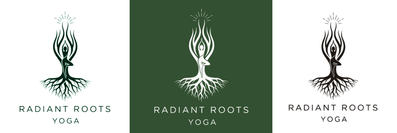
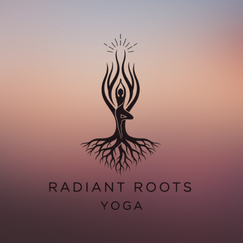
We developed a complete brand identity rooted in nature, growth, and quiet strength. The logo mark, a figure in practice rising from roots, captures the studio's philosophy in a single image: grounded, radiant, alive.
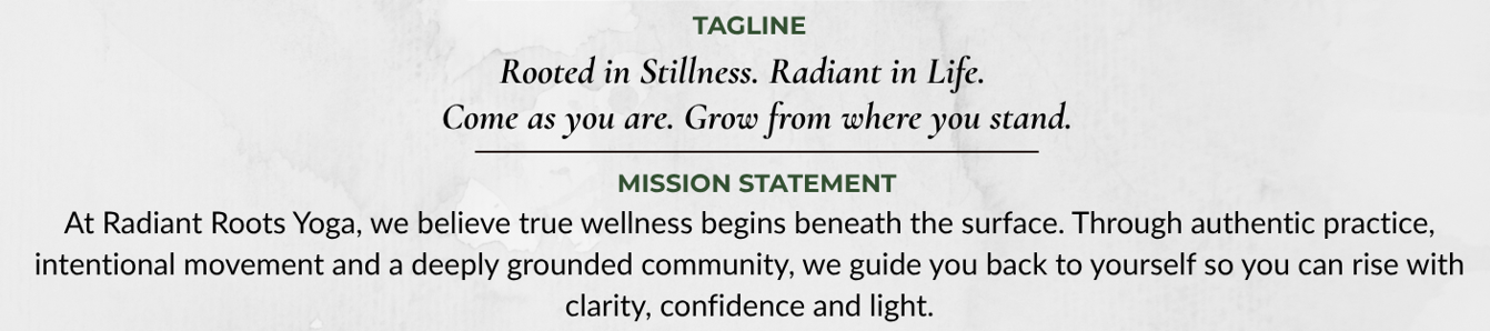
From there, we built out a full brand system: color palette, typography, tagline, brand voice guidelines, and a comprehensive style guide, everything needed to show up consistently and confidently across every touchpoint.
- Custom logo suite: primary, reversed, and dark variations
- Color palette: Myrtle Green, Blush, Sand Dune, Charcoal
- Typography system: Cormorant Garamond + Lato
- Tagline and brand voice guidelines
- Full brand style guide delivered as a PDF
- All files in web and print-ready formats
Color & Typography

A Brand That Feels as Good
as the Practice
Brand in the Wild
From Screen to Real Life.
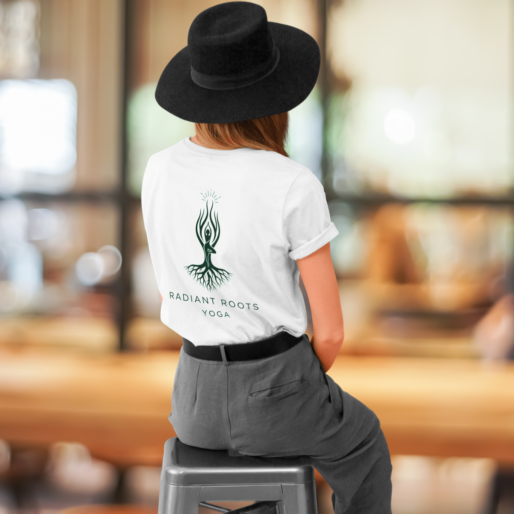
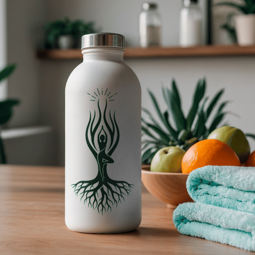
A brand that works everywhere: apparel, merchandise, digital, and beyond.
"Our new logo and brand style guide gave us the confidence to show up professionally across every platform. SmartEdge nailed our brand personality."
Ready for a Brand Like This?
Let's build something that reflects who you truly are. Book a free discovery call to get started.